

Data analytics helps companies evaluate their competitors’ performance, price points, marketing methods, social media reach, and more. We are always analyzing data, all the time! From the number of visits to a website, the performance of the system, the satisfaction of those who consume a product, sales volumes, and many other elements.
In a nutshell, data visualization is a way to communicate, we go from raw information to easy to analyze (visual) components, to obtain a simple result that allows decision making, and that in an attractive way, can tell a story by itself.
How do we do this?
Let’s talk about the creation process. If there is data, we must ensure that the graphics used are correct. It is true that several types of charts may seem to fit without a problem, however, not all of them fulfill the objective of expressing the right message.
The first step is to identify the questions we need to answer with our charts, at this point indicators, measures, KPIs, among others, come into play. This allows us to order our ideas, and clarity on the information available.
Four questions we should ask ourselves to choose a chart
1. Do we have to compare variables?
Part of the usefulness of graphs is to make comparisons that allow us to recognize differences or similarities. Comparisons should be used to know variations between time periods, categories or an expected value.
For these cases we use bar, line or scatter charts. A radar chart can also be used, although this is less advisable because comparisons between variables (more than two) can be confusing.

2. Do we want to analyze the composition?
We refer to composition when we need to understand the parts that make up a whole. That is, how many, and how distinct the parts are from the whole. If the data are simple (less than seven sections) we can use a pie chart.

This is an exception, because this is the least recommended chart type in the list. In any other case we use stacked bars or a more attractive option such as treemap charts.
3. Do we seek to understand the distribution?
When we try to discover patterns of behavior, trends or the relationship between variables, we are analyzing the distribution of the data, and we mostly use the time variable (days, months, years or others). For this, scatter plots, line graphs or histograms allow us to visualize these temporal changes with ease.

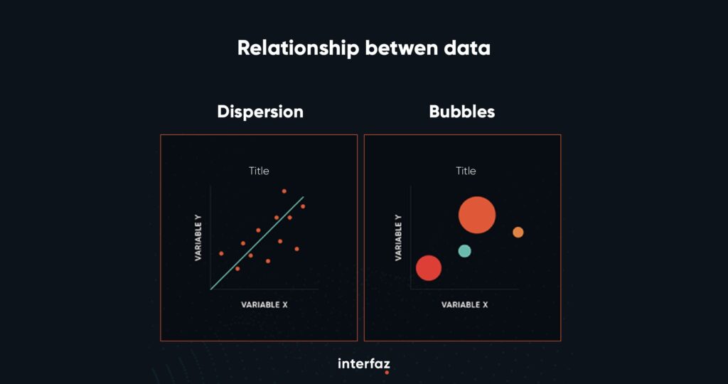
4. Do we try to understand the relationship between the data?
To understand how much one variable, or set of data, influences another, we are interested in understanding how they interact with each other, and what happens when they are combined. By evaluating this, we see if they affect each other positively or negatively.
For these cases, the ideal is to place ourselves in a Cartesian system. That is, we use scatter plots or a bubble chart to visualize more than two variables.
Time to move on to examples
Let’s look at the first example. Let’s answer a typical question: Have sales increased compared to the last month (or any variant, semester, year)?
We have a time variable. Where we are interested in analyzing the trend (growing, decreasing or maintained) we want to understand the distribution. So we use the line chart that allows us to visualize the fluctuation of sales.

On the other hand, if we wanted to understand which is the province, canton or district where our products are most consumed? We seek to know how much each element (place) contributes to the whole, and understand its composition.
In a case like this the recommendation is to use a treemap chart. Each color represents a region and if we are interested we can apply filters to visualize the diversity of categories (more than seven). Therefore, we would discard a pie chart.

Final thoughts
Data visualization allows a more efficient use of time. And facilitates decision making for organizations around the world. As it allows us to communicate a clear message to our audience.
We must lose the fear of using graphics. So we can quickly identify colors and patterns, placing the public’s eye on the important elements. Those that should capture their attention.
Learn more about Interfaz and how we manage data analysis. We are a renowned technology data-analytics company offering businesses a suite of services to drive decision-making and enhance performance with data.
Resources: Data Visualization 101. How to Choose the Right Chart or Graph for Your Data. 4 Easy rules to select the right chart for your data
